

Bar Chart Race Maker
Create stunning animated bar chart races from your data. Drop in a CSV, customize the design, export an MP4. Free to start — no coding required.
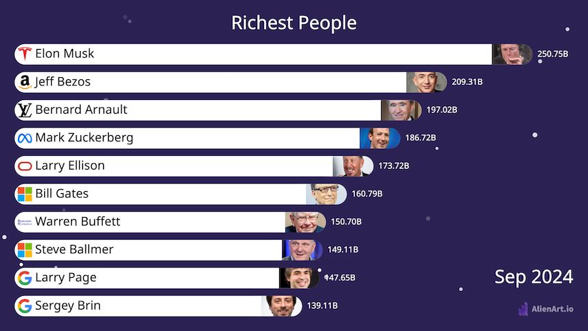
Richest People in the World, Over Time
Built in Alien Art with public Forbes data — use it as your starting point.
Everything You Need for a Viral Bar Chart Race
Designed for creators, journalists, and analysts who want pro results without writing a line of code.
Three steps. Around five minutes from spreadsheet to share-ready video.
Import Data
CSV, Excel, or paste from Wikipedia. Long format with rank-by-period works best.
Customize Design
Pick colors, fonts, bar style, speed, and add images, flags, or your channel logo.
Export Video
Render at up to 60fps in MP4, WebM, or transparent WebP. Post anywhere.
More Bar Chart Race Examples
Real projects shared by Alien Art creators — clone any of them as your starting point.

What Is a Bar Chart Race?
A bar chart race is an animated chart in which horizontal bars representing categories grow, shrink, and reorder over time to show how rankings change across a time series.
Also called a racing bar chart, animated bar chart, or bar graph race, the format makes the highest value pull ahead at the top while lower-ranked items slide down or drop off entirely. Each frame represents one period (a year, month, day, or whatever step your data uses), and the smooth transitions between frames are what make the visualization feel alive.
The format went viral in 2019 after journalist John Burn-Murdoch built his “most populous cities” race at the Financial Times, and Matt Navarra’s tweet of it racked up millions of views. Since then, bar chart races have become one of the most-shared formats on YouTube, TikTok, X (Twitter), and LinkedIn — turning ordinary spreadsheets into stories that viewers actually watch to the end.
They work best when you have ranked time-series data — the same set of categories measured repeatedly over time. Common examples include richest people year-by-year, country GDP over decades, top YouTube channels by subscribers, cryptocurrency market caps, sports league standings, and brand revenue history. The drama comes from upsets: the moment Apple overtakes Exxon, Tesla overtakes Toyota, or one country’s economy passes another.
Traditionally, building one required Python (matplotlib + bar_chart_race), D3.js, or Flourish’s template editor. Alien Art removes the coding step entirely — upload a CSV or paste a Wikipedia table, customize colors and fonts in a visual editor, then export a 60fps MP4 you can drop straight into a YouTube video, Reel, or TikTok.
Frequently Asked Questions
Last updated
How do I make a bar chart race for free?
Sign up for Alien Art free, import a CSV or Excel file (or paste data from Wikipedia), pick a bar chart race template, and click Export. The free plan lets you render videos up to 3 minutes long with 30 minutes of monthly export budget at 30 fps in MP4. No credit card required to get started.
Can I make a bar chart race in Excel?
Excel doesn’t produce true animated bar chart races out of the box — you’d need a paid add-in or VBA macro and the result is hard to export as video. Most creators prepare their data in Excel, then drop the .xlsx file into Alien Art to handle the animation and MP4 export.
What data format do I need?
You need ranked values for the same set of items measured across time periods — for example, one row per person/company/country, with a column for each year. Alien Art accepts CSV, XLSX, pasted Wikipedia tables, and direct manual entry. Missing values are interpolated automatically.
Can I export as MP4 video?
Yes. Free exports MP4 at 30 fps. Pro exports MP4, WebM, and transparent WebP at up to 60 fps with no watermark and unlimited monthly minutes — ideal for YouTube, Shorts, Reels, and TikTok.
Can I use bar chart race videos commercially?
Yes — on monetized YouTube channels, TikTok, client work, presentations, even broadcast TV. Many creators make a living publishing bar chart race videos rendered with Alien Art.
How is this different from Flourish?
Flourish is built around interactive web embeds; video export sits behind their paid plan. Alien Art is built video-first — smooth 60fps MP4 with full control over fonts, colors, and motion is the core product, and the free plan still exports a real video file (with a small watermark) instead of a watermarked iframe.
Make Your Bar Chart Race Now
Free to start. No install. Export an MP4 you can post on YouTube, TikTok, or X in the next few minutes.